


The world of website design never stops making us all dizzy with its constant changes. Every year brings a new trend that forces business owners to tear down their site layouts just to look modern for their clients.
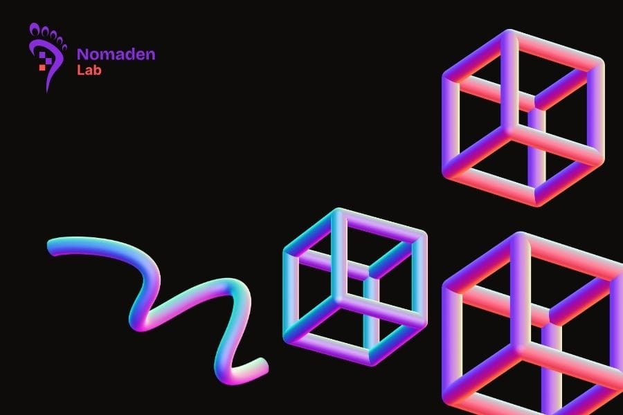
Bento Grid serves as living proof of how a single trend can dominate the digital industry in just months. We are probably all tired of seeing the same old website layouts that have haunted our phone screens since the early internet.
The modular style inspired by Japanese lunch boxes has now officially become the new mecca for world-class designers. Such a phenomenon exists because modern human eyes are weary of looking at cluttered and disorganized digital information.
We can no longer rely on standard templates if we want our businesses to stand out in the coming year. Premium aesthetics are now measured by how neatly you can arrange information without making visitors feel lost or confused.
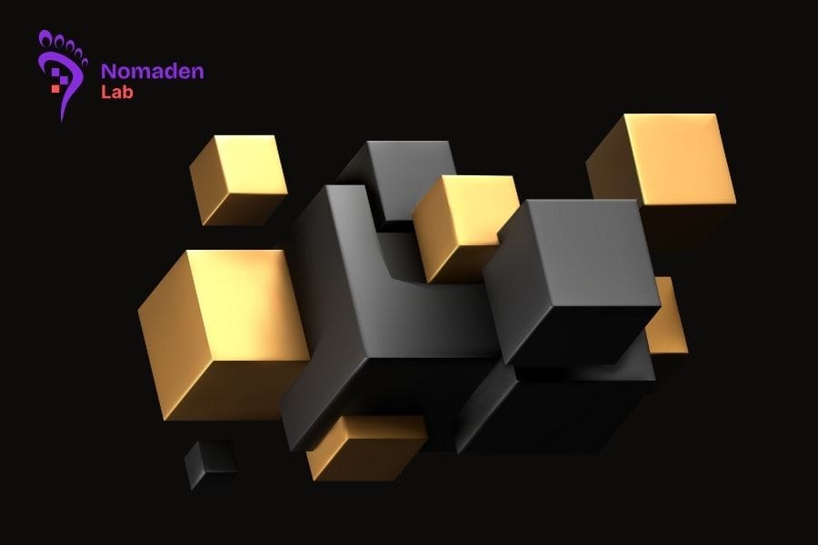
We see many major brands migrating to grid layouts because they are seen as more honest in delivering messages. The neatness of these asymmetric boxes provides a futuristic and professional impression that other design styles simply cannot achieve.
Psychological Reasons Humans Love Neatly Organized Modular Layouts
Our brains naturally search for patterns and order within every visual chaos we encounter in our daily lives. Grid layouts provide a sense of security and control for visitors as they begin scanning content from top to bottom.
Such neatness makes complex information feel much lighter and easier to consume in a very short amount of time. You certainly do not want potential clients to leave just because they are confused about which button to click.
Well-organized box structures also function as a trust signal for anyone who visits your digital home. An orderly design reflects how you manage your business with great precision and attention to the smallest possible details.
We often do not realize that modular layouts actually mimic the way apps work on our modern smartphones. This familiarity makes navigation within the website feel very natural for users who are already used to the mobile ecosystem.
Visitors will feel more comfortable staying longer if every visual element has its own clearly defined home. Our focus remains on providing a browsing experience that does not tire the eyes while maintaining a very strong visual impact.
Incredible Flexibility for Mobile Devices and General Responsiveness
The biggest challenge for designers today is creating a look that remains consistent across various different screen sizes. Modular grids provide a clever solution because these boxes can shift and adapt themselves with great flexibility.
A desktop display that looks wide can easily transform into an elegant vertical stack when opened on a phone. This ease ensures that premium aesthetics will not disappear just because visitors are using a much smaller device.
We no longer need to create separate designs that consume a lot of time and additional operational costs. Grid structures allow the visual adaptation process to run automatically without ruining the information hierarchy we have already built.
Website performance also stays protected because grid logic is usually much easier for modern browsers to read and process. Cleaner and better-structured code will make the page loading process much faster for anyone accessing your site.
You will see how visual elements remain sharp and proportional without any parts being forcibly cut off. Such technical advantages are the primary reason why this style will remain highly relevant for many years to come.
Strategies for Building Premium Branding Through Sleek Visuals
Sleek and minimalist visuals serve as the main key if you want to target the high-end market on the internet. Premium brands generally do not like to show off in a tacky or excessive way when using certain graphic elements.
Bento Grid provides enough breathing room for every image and text that you want to highlight to your audience. White space around the boxes actually becomes a symbol of luxury that middle-class websites usually do not possess.
We can set information priorities by giving larger box sizes to your most superior or profitable services. This visual strategy indirectly guides the visitor’s eye to the parts that generate the most conversions for your business.
The use of appropriate typography within the grid boxes will significantly strengthen your brand character. A combination of modular layouts and elegant fonts creates a visual harmony that is difficult for any site visitor to forget.
Never underestimate the power of simplicity in building a digital identity that is both classy and timeless. Every box in that grid is a canvas to tell your business values in a very modern and efficient way.
Changing trends are often exhausting but following aesthetic developments is a mandatory task for every serious business owner. We must be brave enough to leave old styles that have started to feel obsolete and irrelevant.
Applying the latest design standards will place your brand at the very front of the digital industry competition. Make sure you choose a partner who understands how to blend grid art with incredibly fast access speeds.
Let us welcome a new era of website design that is more human and prioritizes comfort for every internet user. Your website is a digital face that must be maintained with the highest aesthetic standards you can reach.