


Understanding the basic techniques for creating bento grid layouts is essential for anyone wanting to build a modern and structured website. Using the Elementor Container feature is now the most efficient solution to replace old column systems.
The neat modular structure allows us to display various types of information in one visual area without disturbing the visual comfort of visitors. We will learn how these grid technical settings can work perfectly across all your digital devices.
The flexibility offered by the Container system gives designers the freedom to experiment with asymmetric box sizes that remain visually harmonious. We will guide you step-by-step to master this advanced feature in a very systematic way.
Proper infrastructure preparation will ensure the website creation process runs smoothly without technical obstacles regarding screen responsiveness. You will realize that building premium aesthetics can actually be done with relatively simple logic.
Initial Preparation and Activating the Grid Container Feature
The first step you must take is ensuring that the Flexbox Container or Grid Container feature is active in your WordPress dashboard settings. Without activating this experimental feature you will not be able to create flexible modular layouts.
Make sure the Elementor version you are using is the latest version to avoid technical bugs when adjusting the spacing between boxes in that grid. Here are some technical steps you need to consider before you start building your layout:
- Go to the Elementor menu then select Settings and open the Features tab to manually activate the Flexbox Container and Grid Container options.
- Determine the basic column structure you want to use as the main foundation for the entire bento grid look you will build on the page.
- Use flexible measurement units such as percentages or fractional units so these boxes can automatically adapt to the user’s screen size.
- Ensure the gaps or spacing between elements are set consistently so the website display remains clean and has enough breathing room for the eyes.
Mature basic settings will make it easier for us when moving to the detailed visual customization stage in the next steps. You must be disciplined in maintaining consistent numerical values for every spacing setting so the final result looks professional.
Techniques for Adjusting Asymmetric Box Sizes for Bento Aesthetics
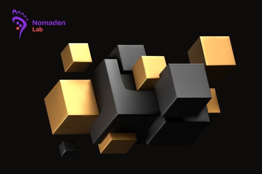
The main key to bento grid beauty lies in the variation of box sizes that complement each other within one large frame. We can make one box stand out by giving it wider dimensions compared to the surrounding supporting boxes on the screen.
The Elementor Grid system allows us to determine specifically how many columns or rows a single element will occupy. Pay attention to the following dimension setting techniques so your layout does not look stiff or boring for potential clients:
- Utilize the Column Span feature to widen a box horizontally across several columns to get a more dominant visual area for your main content.
- Use the Row Span feature if you want to create vertical elements that stretch down to display portrait images or long feature lists.
- Adjust content positioning within the box using Align Items and Justify Content features so text stays centered even if the box size changes.
- Experiment with combinations of large and small boxes to create a dynamic visual rhythm that remains stable and very neatly organized.
Bravery in playing with proportions will give a unique character to the digital brand you are building through this platform. You must constantly monitor the balance between text and image elements so no single box feels too crowded or cluttered.
Optimizing Responsiveness and Mobile First Display Settings
A design that looks beautiful on desktop does not necessarily provide the same good experience when accessed through much narrower smartphone screens. We must perform specific adjustments so the bento grid system transforms into a neat vertical stack.
Elementor provides very detailed responsive setting options for every container you have previously created in the editor. Follow these optimization guides so your website stays fast and comfortable for anyone to use wherever they are currently located:
- Change the number of columns to only one or two on mobile displays to avoid boxes that are too narrow and difficult for human eyes to read.
- Re-adjust the order of elements so the most important information remains at the very top of your visitor’s smartphone screen for better conversion.
- Reduce the spacing between boxes specifically for mobile displays so the limited screen space is not wasted on unnecessary empty margins.
- Perform direct testing using real devices to ensure all buttons and links can be easily clicked using the user’s thumb while browsing your site.
These optimization steps have a huge impact on SEO scores and overall user comfort. We want every visitor to get the same premium impression regardless of what type of device they are currently using to access your digital assets.
Success in creating bento grid layouts will heavily depend on your precision in adjusting every small detail within that container system. Let us keep innovating in creating digital assets that possess very capable and modern technical functionalities.